As part of our 5-person team, we designed the product Zynda to alleviate the expanding crisis of prescription drug abuse. I worked mainly on creating the brand identity and the mobile app design which I had pitched during the final presentation and brainstormed product design ideas and go-to market strategies.
Interface Design, Branding, Go-to-market Strategies, Product Design
Oct 2020
According to a Partnership Attitude Tracking Study conducted by the Partnership for Drug-Free Kids and MetLife Foundation from 2008-2012, “One in four teens reported having misused or abused a prescription drug at least once in their lifetime, which was up from 18 percent in 2008 to 24 percent in 2012, and translated to about 5 million teens, or a 33 percent increase over a five-year period.The study also indicated that “More than 42 percent who have misused or abused a prescription drug obtained it from their parent’s medicine cabinet”
Since easy access is responsible for much of the overdose seen in the teenage years, we sought to address the need for safe storage of prescribed medications in particular.
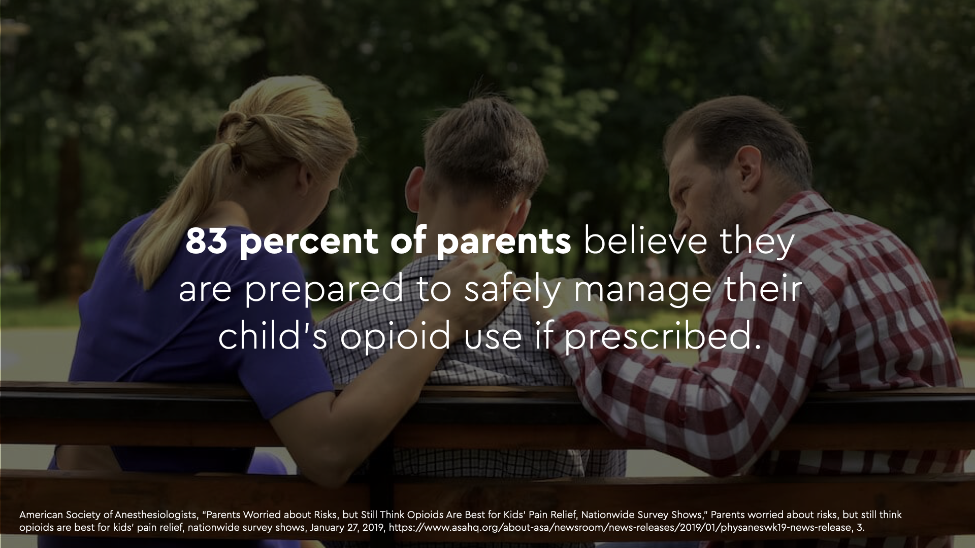
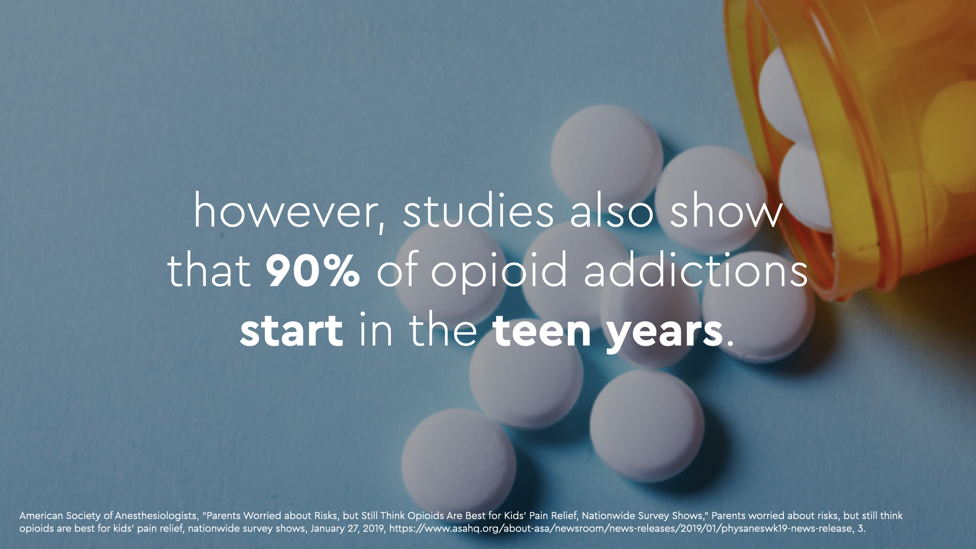
How might we design a practical solution for young people and their parents to properly store and manage prescribed medications in order to prevent addiction in the future.
First, a guardian opens and fills the container with the medication by scanning a code with the app. They can then set the medication schedule and number of pills added, and the container will take care of the rest.
The front of the container features a display with essential information on the medication.
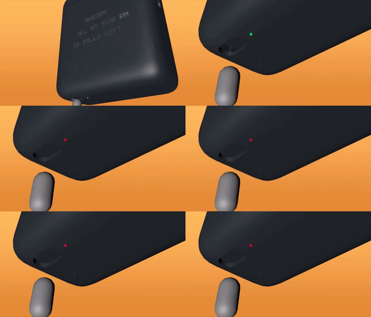
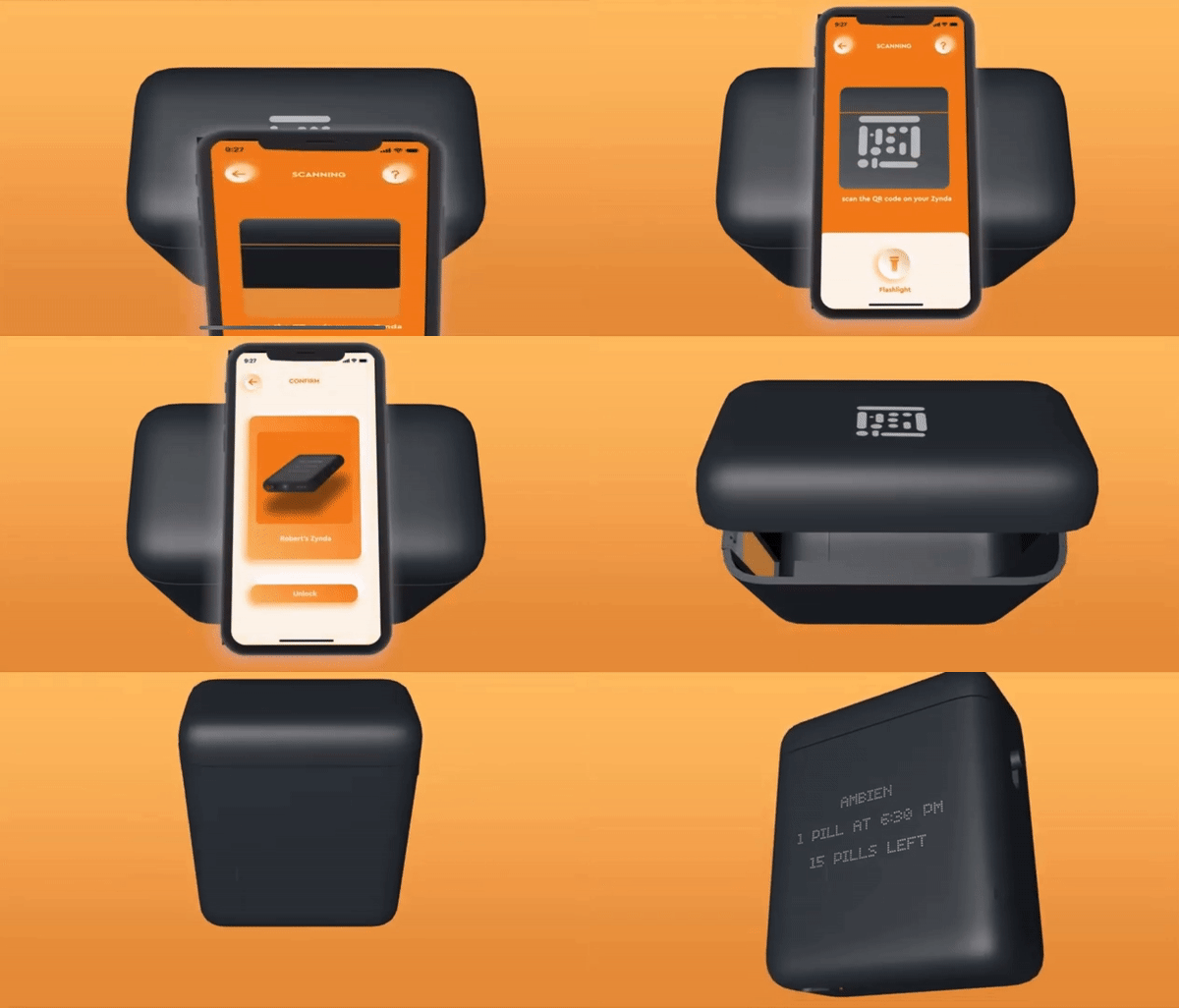
When it’s time for the user to take their dose, dispenser unlocks turning the light green. The user uses a child-proof mechanism, pushing the button on the right of the container with their thumb inwards while pushing downwards. This mechanism slides open the dispenser.
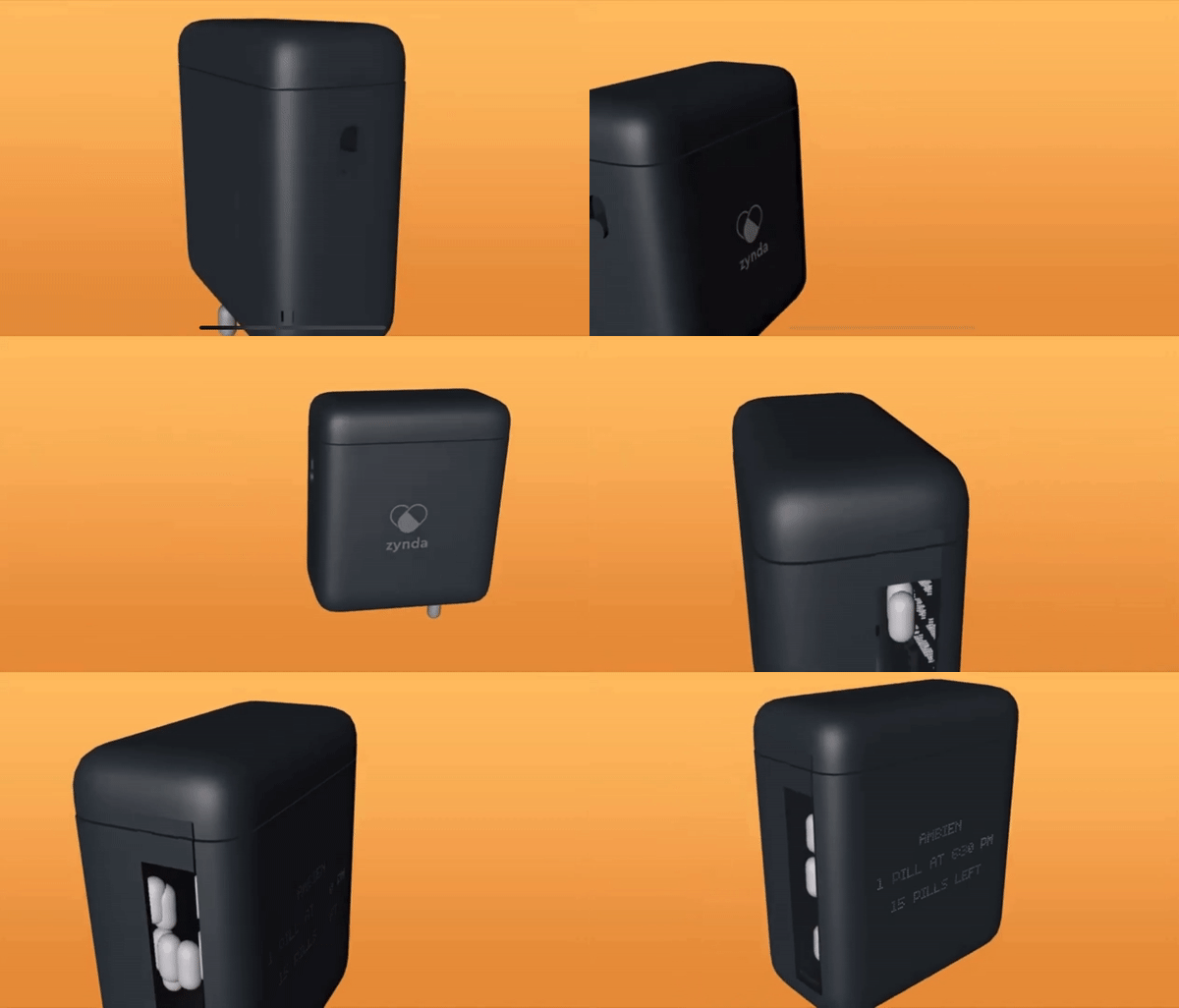
The zynda remains locked until the time for their next dose.
The shape and size of the device fits into a back pocket, replacing the bulkiness of a cylindrical shape and fits well into the palm of an average young adult.
There is a little internal dispensing container large enough for only 1 pill at a time, which slides open mechanically, and closes when one pill falls in.
The button uses a spring and two-gear mechanism and springs back up when the user lets go of the button.
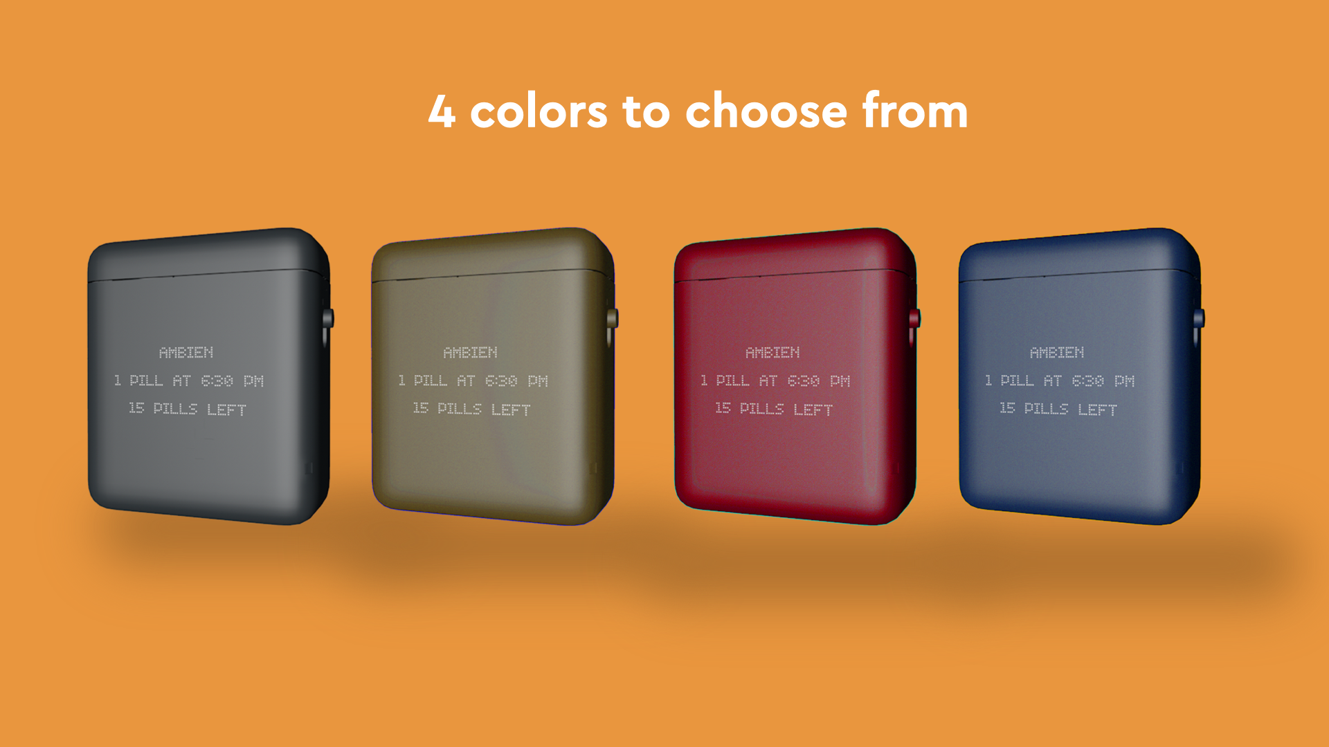
Users will have a wide range of colors to choose from, including space grey, champagne gold, berry red, and air force blue to match their aesthetic preferences.
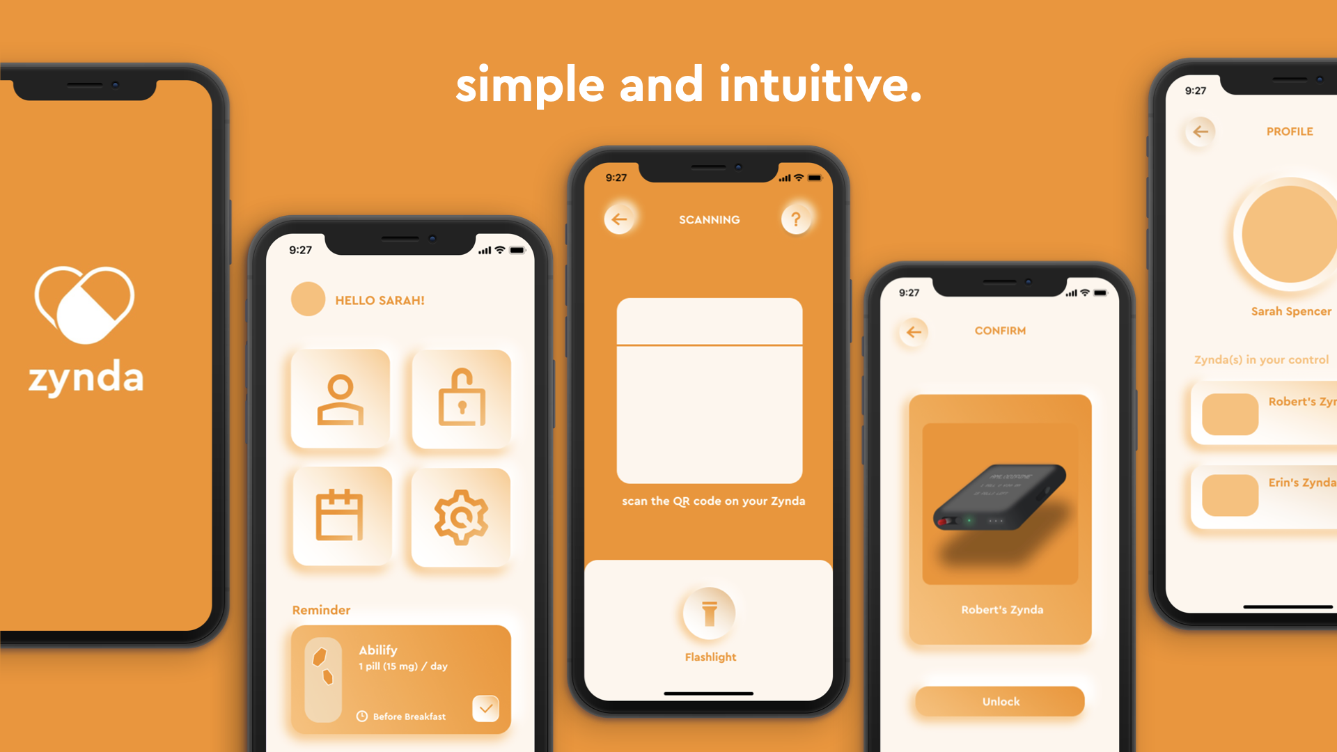
The simple and intuitive app design makes it easy for parents to track and control their teen’s dosage, preventing the likelihood of future overdose.
To fulfill those functions, our app features a scanning page for the parents to unlock their adolescent’s Zynda for refills, a confirmation page to prevent them from accidentally unlocking a pill container, a scheduling page for reminders and medication timelines, and finally, a profile section that allows user management of connections to Zyndas.
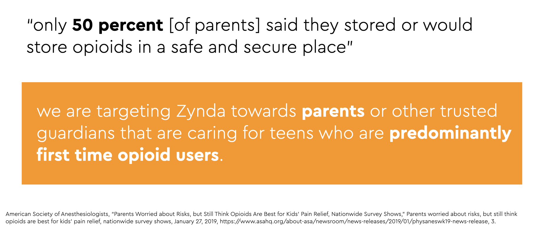
According to the American Association of Anesthesiologists, 50 percent of parents don’t store their medication in a safe place, making it easy for teens to gain access to them. Since Zynda’s focus is on preventing future overdose, we are targeting our product towards parents who either want a secure place to store their medication, or who want to safely manage their teens’ medication intake.
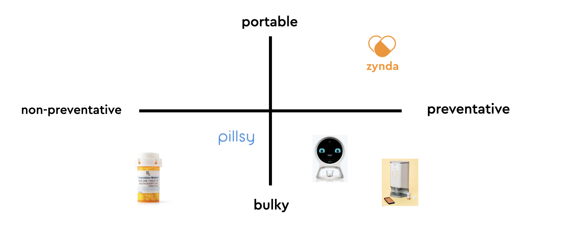
Although there are other products out there that offer advanced preventative measures for elderly patients, like Hero (a smart medicine cabinet) and Pria (a smart pill manager), these solutions are often bulky and expensive, and are not targeted towards patients that are adolescents and young adults.
On the other hand, traditional pill bottles as well as smart pill bottles like Pillsy offer more portable and accessible solutions, but they have less of a preventative focus and are primarily administrative.
Zynda solves this problem by being portable, preventative, and relatively inexpensive for our users.
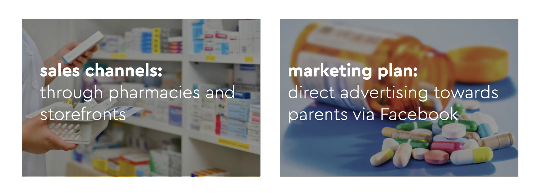
Our primary sales channels will be through pharmacies and storefronts. By offering the parent our product while buying the prescription, they are more likely to understand the importance of properly managing their teen’s medication.
In order to expose more parents to Zynda, we plan on advertising our product on Facebook since our target market are the parents of young adults and adolescents that might be at risk of overdosing on pain medications and need a preventative measure.
This is the price breakdown of the cost per unit to make our pill dispenser. We accounted for the display dot matrix, the computer, battery, communication software, circuit board, and outside material.
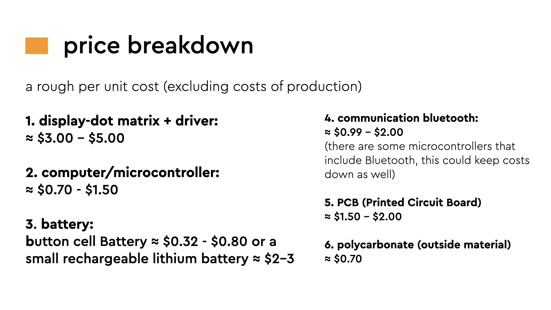
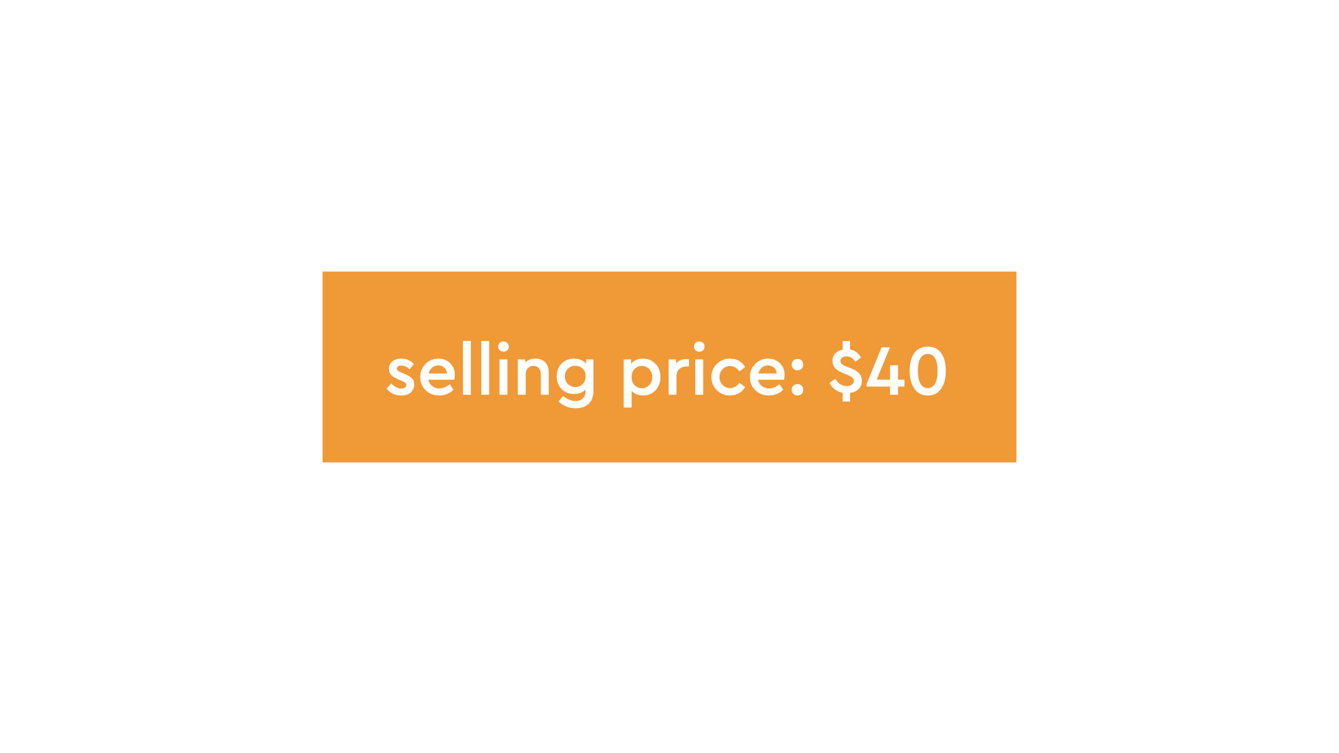
So in total, our pill dispensing device will cost approximately $15 to manufacture, and our selling price will be $40 dollars.